> ## Documentation Index
> Fetch the complete documentation index at: https://docs.dema.ai/llms.txt
> Use this file to discover all available pages before exploring further.
# Details view
> Learn how to analyze spend recommendations, saturation curves, adstock effects, and channel contributions in Dema's MMM Details view.
The **Details** view provides in-depth analysis of your marketing performance and optimization recommendations. It includes detailed spend recommendations, visualizations of saturation curves, adstock effects, and historical contribution breakdowns.
Access the Details view by clicking the **Details** tab when viewing an MMM configuration.
***
## Spend recommendation table
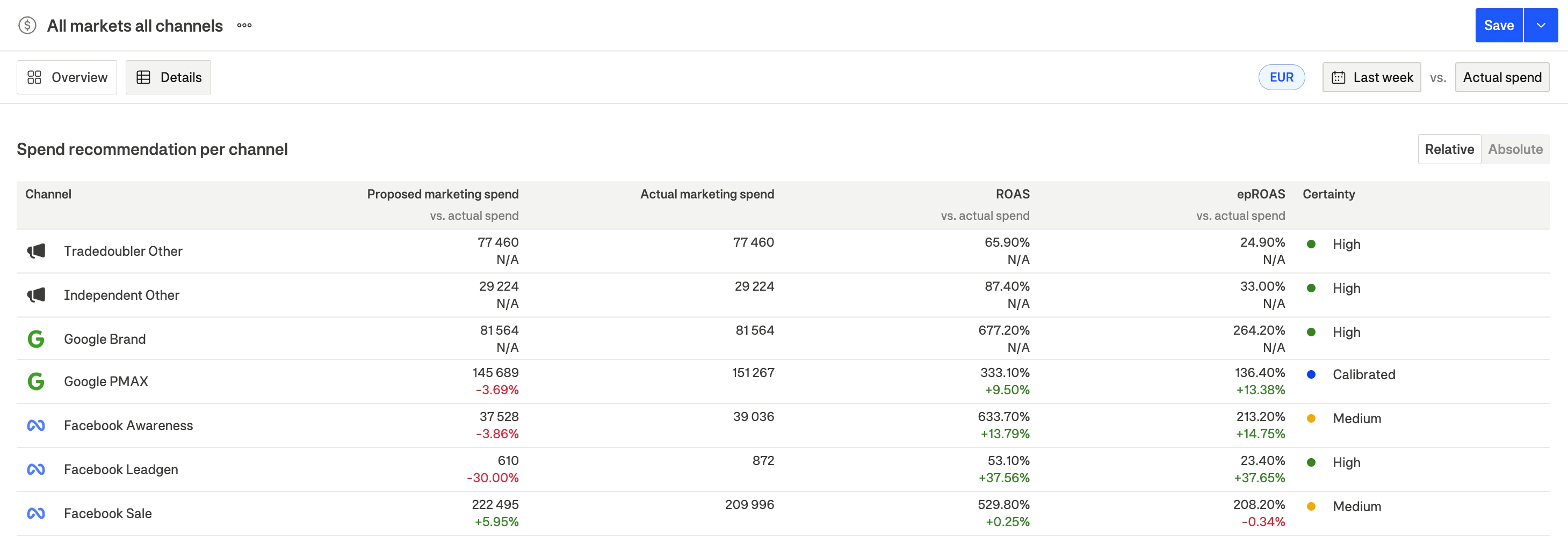
The spend recommendation table is the primary tool for understanding what changes the model recommends for each channel.
 ### Table columns
| Column | Description |
| ---------------------------- | ---------------------------------------------------- |
| **Channel** | Marketing channel name with platform icon |
| **Proposed marketing spend** | Recommended spend amount and % change vs. actual |
| **Actual marketing spend** | What was actually spent in the selected period |
| **ROAS** | Achieved ROAS and % change vs. actual spend scenario |
| **epROAS** | Effective profit ROAS and % change vs. actual |
| **Certainty** | Model confidence indicator for this channel |
### Understanding the certainty column
Each channel displays a certainty indicator based on data quality and calibration:
| Indicator | Appearance | Meaning |
| -------------- | ---------- | ------------------------------------------------------------------ |
| **High** | Green dot | High confidence—reliable data and/or calibrated with experiments |
| **Medium** | Orange dot | Moderate confidence—reasonable data but some uncertainty |
| **Calibrated** | Blue dot | Channel has been calibrated with incrementality experiment results |
| **Run test** | Red dot | Low confidence—recommend running an incrementality test |
Prioritize implementing recommendations for channels with "High" or "Calibrated" certainty. For channels showing "Run test", consider running an incrementality experiment before making large budget changes.
### Summary rows
The table includes summary rows at the bottom:
| Row | Description |
| ------------------ | ------------------------------------------------------- |
| **Paid marketing** | Totals for all paid marketing channels |
| **Baseline** | Organic/brand contribution (not controllable via spend) |
| **Seasonal** | Seasonal effects contribution |
| **Control** | Custom control variable contributions |
| **Total** | Sum of all contributions |
### Relative vs. Absolute toggle
Use the **Relative / Absolute** toggle in the table header to switch between:
* **Relative**: Shows percentage changes (e.g., +15%, -8%)
* **Absolute**: Shows actual currency amounts (e.g., €3,000)
***
## Channel contribution chart
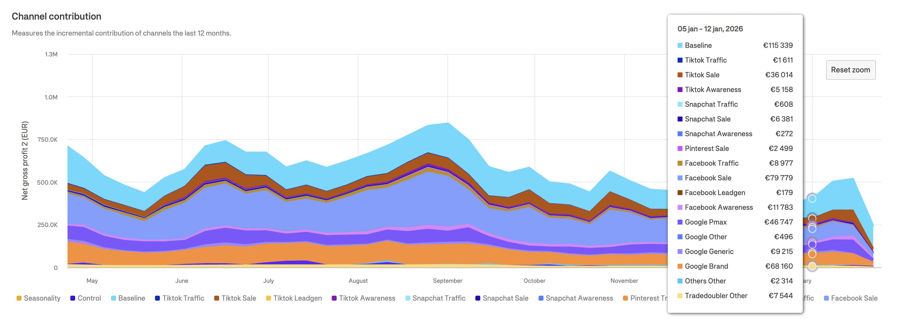
The contribution chart shows how each channel has contributed to your target metric over time.
### Table columns
| Column | Description |
| ---------------------------- | ---------------------------------------------------- |
| **Channel** | Marketing channel name with platform icon |
| **Proposed marketing spend** | Recommended spend amount and % change vs. actual |
| **Actual marketing spend** | What was actually spent in the selected period |
| **ROAS** | Achieved ROAS and % change vs. actual spend scenario |
| **epROAS** | Effective profit ROAS and % change vs. actual |
| **Certainty** | Model confidence indicator for this channel |
### Understanding the certainty column
Each channel displays a certainty indicator based on data quality and calibration:
| Indicator | Appearance | Meaning |
| -------------- | ---------- | ------------------------------------------------------------------ |
| **High** | Green dot | High confidence—reliable data and/or calibrated with experiments |
| **Medium** | Orange dot | Moderate confidence—reasonable data but some uncertainty |
| **Calibrated** | Blue dot | Channel has been calibrated with incrementality experiment results |
| **Run test** | Red dot | Low confidence—recommend running an incrementality test |
Prioritize implementing recommendations for channels with "High" or "Calibrated" certainty. For channels showing "Run test", consider running an incrementality experiment before making large budget changes.
### Summary rows
The table includes summary rows at the bottom:
| Row | Description |
| ------------------ | ------------------------------------------------------- |
| **Paid marketing** | Totals for all paid marketing channels |
| **Baseline** | Organic/brand contribution (not controllable via spend) |
| **Seasonal** | Seasonal effects contribution |
| **Control** | Custom control variable contributions |
| **Total** | Sum of all contributions |
### Relative vs. Absolute toggle
Use the **Relative / Absolute** toggle in the table header to switch between:
* **Relative**: Shows percentage changes (e.g., +15%, -8%)
* **Absolute**: Shows actual currency amounts (e.g., €3,000)
***
## Channel contribution chart
The contribution chart shows how each channel has contributed to your target metric over time.
 ### Reading the chart
* **X-axis**: Time (weekly)
* **Y-axis**: Contribution to target metric
* **Colored areas**: Stacked contribution from each channel
### What it shows
* **Channel mix evolution**: How the balance of channel contributions changes over time
* **Seasonality patterns**: Peaks and troughs in overall performance
* **Baseline contribution**: The dark area at the bottom showing organic/brand performance
Use this chart to understand historical trends. If a channel's contribution has been declining despite stable spend, it may be reaching saturation.
***
## Saturation spend chart
The saturation chart visualizes the diminishing returns curve for each channel, showing the relationship between spend and profit.
### Reading the chart
* **X-axis**: Time (weekly)
* **Y-axis**: Contribution to target metric
* **Colored areas**: Stacked contribution from each channel
### What it shows
* **Channel mix evolution**: How the balance of channel contributions changes over time
* **Seasonality patterns**: Peaks and troughs in overall performance
* **Baseline contribution**: The dark area at the bottom showing organic/brand performance
Use this chart to understand historical trends. If a channel's contribution has been declining despite stable spend, it may be reaching saturation.
***
## Saturation spend chart
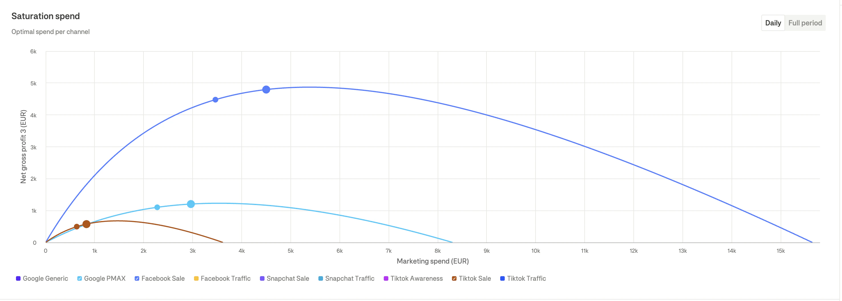
The saturation chart visualizes the diminishing returns curve for each channel, showing the relationship between spend and profit.
 ### Understanding saturation curves
Each curve shows:
* **X-axis**: Marketing spend amount
* **Y-axis**: Contribution to target metric
* **Curve shape**: How returns diminish as spend increases
### Key points on the curve
| Point | Meaning |
| -------------------- | ---------------------------------------------------------------- |
| **Current spend** | Where you're currently spending (dot on curve) |
| **Optimal spend** | The point where marginal returns equal marginal costs |
| **Saturation point** | Where the curve flattens—additional spend yields minimal returns |
### Interpreting the curves
1. **Steep early curve**: Channel has high efficiency at lower spend levels
2. **Flat curve**: Channel is near or past saturation
3. **Dot to the right of optimal**: You're overspending on this channel
4. **Dot to the left of optimal**: You're underspending—room to scale
Each channel is represented by a different colored curve, with dots indicating current spend positions.
### Daily vs. Full period toggle
Use the toggle to switch between:
* **Daily**: Shows curves based on daily parameters (more granular)
* **Full period**: Shows aggregated curves for the entire selected period
### Tooltip information
Hover over any point on the curve to see:
* Channel name
* Marketing spend amount
* Target metric contribution
* Return at that spend level
* Marginal return (incremental return on next dollar)
### Understanding saturation curves
Each curve shows:
* **X-axis**: Marketing spend amount
* **Y-axis**: Contribution to target metric
* **Curve shape**: How returns diminish as spend increases
### Key points on the curve
| Point | Meaning |
| -------------------- | ---------------------------------------------------------------- |
| **Current spend** | Where you're currently spending (dot on curve) |
| **Optimal spend** | The point where marginal returns equal marginal costs |
| **Saturation point** | Where the curve flattens—additional spend yields minimal returns |
### Interpreting the curves
1. **Steep early curve**: Channel has high efficiency at lower spend levels
2. **Flat curve**: Channel is near or past saturation
3. **Dot to the right of optimal**: You're overspending on this channel
4. **Dot to the left of optimal**: You're underspending—room to scale
Each channel is represented by a different colored curve, with dots indicating current spend positions.
### Daily vs. Full period toggle
Use the toggle to switch between:
* **Daily**: Shows curves based on daily parameters (more granular)
* **Full period**: Shows aggregated curves for the entire selected period
### Tooltip information
Hover over any point on the curve to see:
* Channel name
* Marketing spend amount
* Target metric contribution
* Return at that spend level
* Marginal return (incremental return on next dollar)
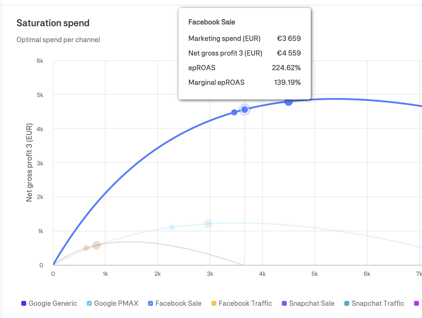 When marginal return drops below 100%, additional spend is no longer profitable. The optimal point is where marginal return equals approximately 100%.
***
## Cumulative adstock effect chart
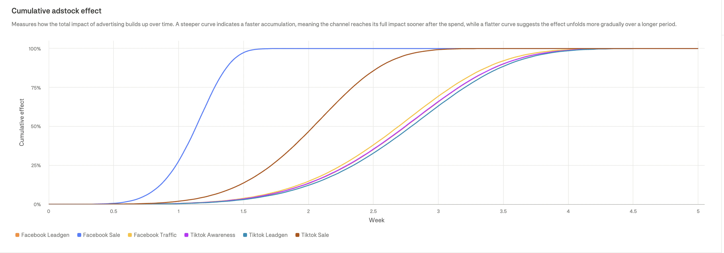
The adstock chart shows how advertising effects accumulate over time for each channel.
When marginal return drops below 100%, additional spend is no longer profitable. The optimal point is where marginal return equals approximately 100%.
***
## Cumulative adstock effect chart
The adstock chart shows how advertising effects accumulate over time for each channel.
 ### Understanding adstock
Adstock represents the **carryover effect** of advertising:
* When you spend on a channel, the impact doesn't happen instantly
* Effects build up over days/weeks before reaching full impact
* Eventually, effects decay as the advertising impression fades
### Reading the chart
* **X-axis**: Time (weeks after spend)
* **Y-axis**: Cumulative effect (0% to 100%)
* **Curves**: Each channel's accumulation pattern
### Interpreting adstock curves
| Curve type | Meaning | Typical channels |
| ----------------------- | --------------------------- | ----------------------------- |
| **Steep (fast rise)** | Quick impact, short memory | Search, Shopping, Retargeting |
| **Gradual (slow rise)** | Delayed impact, long memory | Display, Video, Awareness |
### Practical implications
1. **Fast adstock channels**: Changes in spend will show results quickly (1-2 weeks)
2. **Slow adstock channels**: Need patience—full impact takes 4+ weeks to materialize
3. **Testing considerations**: Allow sufficient time for experiments on slow-adstock channels
When evaluating channel performance, account for adstock timing. A recent spend increase on a slow-adstock channel won't show full returns immediately.
***
## Missed potential chart
The missed potential chart compares actual performance against what could have been achieved with optimal spend allocation, based on your configured **Model settings** (optimization target, budget constraints, and guardrails).
### Understanding adstock
Adstock represents the **carryover effect** of advertising:
* When you spend on a channel, the impact doesn't happen instantly
* Effects build up over days/weeks before reaching full impact
* Eventually, effects decay as the advertising impression fades
### Reading the chart
* **X-axis**: Time (weeks after spend)
* **Y-axis**: Cumulative effect (0% to 100%)
* **Curves**: Each channel's accumulation pattern
### Interpreting adstock curves
| Curve type | Meaning | Typical channels |
| ----------------------- | --------------------------- | ----------------------------- |
| **Steep (fast rise)** | Quick impact, short memory | Search, Shopping, Retargeting |
| **Gradual (slow rise)** | Delayed impact, long memory | Display, Video, Awareness |
### Practical implications
1. **Fast adstock channels**: Changes in spend will show results quickly (1-2 weeks)
2. **Slow adstock channels**: Need patience—full impact takes 4+ weeks to materialize
3. **Testing considerations**: Allow sufficient time for experiments on slow-adstock channels
When evaluating channel performance, account for adstock timing. A recent spend increase on a slow-adstock channel won't show full returns immediately.
***
## Missed potential chart
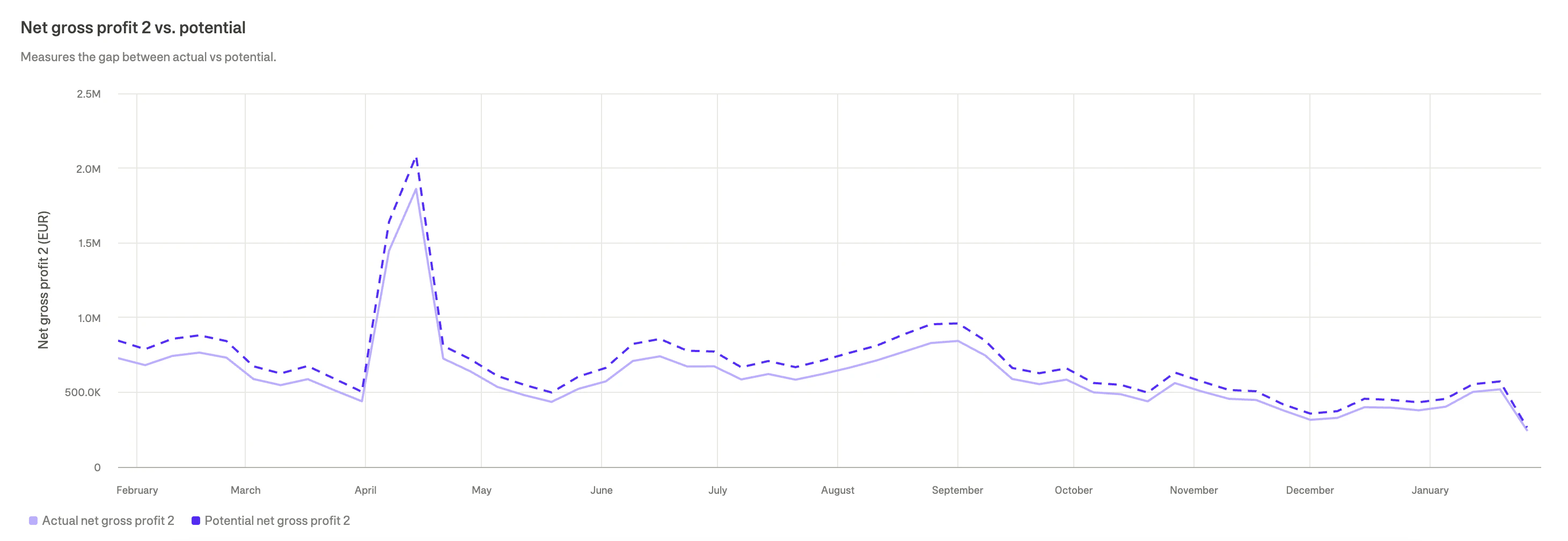
The missed potential chart compares actual performance against what could have been achieved with optimal spend allocation, based on your configured **Model settings** (optimization target, budget constraints, and guardrails).
 ### Reading the chart
The chart shows two bars:
* **Actual profit**: What you actually achieved
* **Potential profit**: What optimal allocation would have achieved within your configured constraints
The gap between them represents **missed potential**—profit left on the table due to suboptimal allocation. This calculation respects your guardrails and budget limits, so tighter constraints will reduce the potential gap.
### Using missed potential data
1. **Quantify opportunity**: Understand the value of optimization in concrete terms
2. **Prioritize action**: Large missed potential indicates high-priority optimization opportunities
3. **Track improvement**: Monitor how missed potential decreases as you implement recommendations
***
## Filtering and aggregating the Details view
Use the **View** panel on the right sidebar to customize what's displayed and how data is organized.
### Aggregation (pivot)
The aggregation setting allows you to pivot your data by different dimensions. This is one of the most powerful features for analyzing your marketing performance from different angles.
### Reading the chart
The chart shows two bars:
* **Actual profit**: What you actually achieved
* **Potential profit**: What optimal allocation would have achieved within your configured constraints
The gap between them represents **missed potential**—profit left on the table due to suboptimal allocation. This calculation respects your guardrails and budget limits, so tighter constraints will reduce the potential gap.
### Using missed potential data
1. **Quantify opportunity**: Understand the value of optimization in concrete terms
2. **Prioritize action**: Large missed potential indicates high-priority optimization opportunities
3. **Track improvement**: Monitor how missed potential decreases as you implement recommendations
***
## Filtering and aggregating the Details view
Use the **View** panel on the right sidebar to customize what's displayed and how data is organized.
### Aggregation (pivot)
The aggregation setting allows you to pivot your data by different dimensions. This is one of the most powerful features for analyzing your marketing performance from different angles.
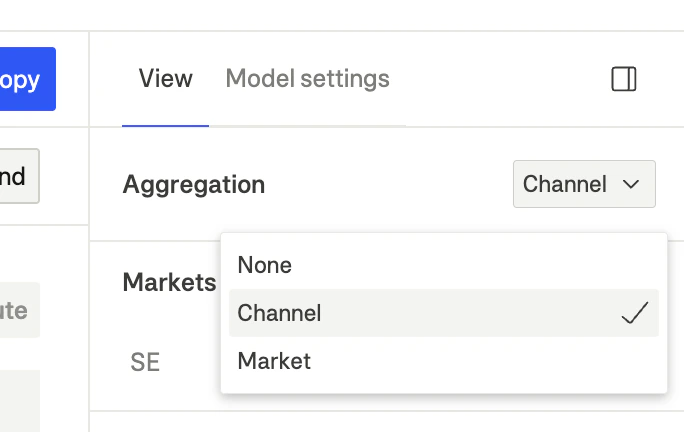 | Mode | What you see | Best for |
| ----------- | ----------------------------------------------- | ----------------------------------------------- |
| **Channel** | All channels aggregated across all markets | Comparing channel performance holistically |
| **Market** | All markets aggregated across all channels | Identifying regional optimization opportunities |
| **None** | Full granularity: channel × market combinations | Detailed analysis of specific combinations |
Start with **Channel** aggregation to get an overview of which channels need attention, then switch to **None** to drill down into specific market-channel combinations that drive the opportunity.
### Markets filter
Filter which geographic markets are included in the analysis:
1. Expand the **Markets** section in the View panel
2. Check/uncheck markets to include or exclude them
3. Use **Select all** to quickly include all markets
When you filter markets, all tables, charts, and metrics update to show only data from the selected markets.
### Channels filter
Filter which marketing channels are displayed:
1. Expand the **Channels** section in the View panel
2. Check/uncheck channels to show or hide them
3. Use **Select all** to quickly include all channels
This is useful for:
* **Platform analysis**: Show only Meta or Google channels
* **Funnel analysis**: Show only awareness or performance channels
* **Focus view**: Hide channels that aren't relevant to your current analysis
### Metrics filter
Control which metrics appear in tables:
1. Expand the **Metrics** section in the View panel
2. Check/uncheck metrics to show or hide them
Available metrics include:
* Marketing spend
* New customer NGP2 + LTV
* Net gross profit 3
* Net gross profit 2
* Gross sales
* ROAS
* epROAS
***
## Date range selection
The date range affects what period is analyzed:
| Period type | Shows |
| -------------------------------- | ----------------------------------------------- |
| **Historical** (Last week, etc.) | Actual vs. optimal for past performance |
| **Future** (Next week, etc.) | Forecasted recommendations for upcoming periods |
Historical analysis helps validate model accuracy and understand what could have been achieved. Future analysis provides actionable recommendations for upcoming budget decisions.
***
## From analysis to action
### Implementing recommendations
1. **Review the spend table**: Identify channels with significant recommended changes
2. **Check certainty**: Prioritize high-certainty channels
3. **Verify with curves**: Confirm the recommendation makes sense given the saturation curve
4. **Consider adstock**: Account for timing when setting expectations
5. **Apply changes gradually**: Respect guardrails to avoid disrupting ad algorithms
### Weekly workflow
1. **Monday**: Review last week's Details to understand performance
2. **Analyze**: Check which recommendations you implemented and their results
3. **Plan**: Use forward-looking analysis for next week's budget allocation
4. **Implement**: Update budgets in ad platforms based on recommendations
5. **Monitor**: Track early signals (CPC, CTR) to validate changes
| Mode | What you see | Best for |
| ----------- | ----------------------------------------------- | ----------------------------------------------- |
| **Channel** | All channels aggregated across all markets | Comparing channel performance holistically |
| **Market** | All markets aggregated across all channels | Identifying regional optimization opportunities |
| **None** | Full granularity: channel × market combinations | Detailed analysis of specific combinations |
Start with **Channel** aggregation to get an overview of which channels need attention, then switch to **None** to drill down into specific market-channel combinations that drive the opportunity.
### Markets filter
Filter which geographic markets are included in the analysis:
1. Expand the **Markets** section in the View panel
2. Check/uncheck markets to include or exclude them
3. Use **Select all** to quickly include all markets
When you filter markets, all tables, charts, and metrics update to show only data from the selected markets.
### Channels filter
Filter which marketing channels are displayed:
1. Expand the **Channels** section in the View panel
2. Check/uncheck channels to show or hide them
3. Use **Select all** to quickly include all channels
This is useful for:
* **Platform analysis**: Show only Meta or Google channels
* **Funnel analysis**: Show only awareness or performance channels
* **Focus view**: Hide channels that aren't relevant to your current analysis
### Metrics filter
Control which metrics appear in tables:
1. Expand the **Metrics** section in the View panel
2. Check/uncheck metrics to show or hide them
Available metrics include:
* Marketing spend
* New customer NGP2 + LTV
* Net gross profit 3
* Net gross profit 2
* Gross sales
* ROAS
* epROAS
***
## Date range selection
The date range affects what period is analyzed:
| Period type | Shows |
| -------------------------------- | ----------------------------------------------- |
| **Historical** (Last week, etc.) | Actual vs. optimal for past performance |
| **Future** (Next week, etc.) | Forecasted recommendations for upcoming periods |
Historical analysis helps validate model accuracy and understand what could have been achieved. Future analysis provides actionable recommendations for upcoming budget decisions.
***
## From analysis to action
### Implementing recommendations
1. **Review the spend table**: Identify channels with significant recommended changes
2. **Check certainty**: Prioritize high-certainty channels
3. **Verify with curves**: Confirm the recommendation makes sense given the saturation curve
4. **Consider adstock**: Account for timing when setting expectations
5. **Apply changes gradually**: Respect guardrails to avoid disrupting ad algorithms
### Weekly workflow
1. **Monday**: Review last week's Details to understand performance
2. **Analyze**: Check which recommendations you implemented and their results
3. **Plan**: Use forward-looking analysis for next week's budget allocation
4. **Implement**: Update budgets in ad platforms based on recommendations
5. **Monitor**: Track early signals (CPC, CTR) to validate changes